While some folks might be quite comfortable looking at a Jackson Pollock all day long in their living room others need a little bit more simplicity before we can see the “insight” of the masterpiece.
The same thing goes with Google Analytics; while the mathematician in us may love to drill deep into the reports, the artistic writer side of the brain would rather see a much better visual layout. When both sides of the brain work together insights become actionable.
Within the MashMetrics Data Adoption Plan we deliver all the rich data in a much more soothing Google Data Studio dashboard. Templates are also a way to view your data with this product.
First, What is Google Data Studio?:
From Google’s mouth:
Google Data Studio turns your data into informative dashboards and reports that are easy to read, easy to share, and fully customizable. Dashboarding allows you to tell great data stories to support better business decisions.
From the mouths of MashMetrics:
Google Data Studio (just call it live) finally allows professionals to turn the insights collected through the amazing metrics collected within Google Analytics, Google Search Console, YouTube, AdWords and more into visually appealing, accessible, presentations the laymen understands.
You can see why we got so excited when in March 2018, Google released Google Data Studio, and a growing list of templates to the world and without limits. We immediately got to work … and likely will never stop. Check out some of the advanced features of our MashMetrics Awareness and Engagement Dashboards here.
In the meantime, here are some of the key benefits we have seen so far:
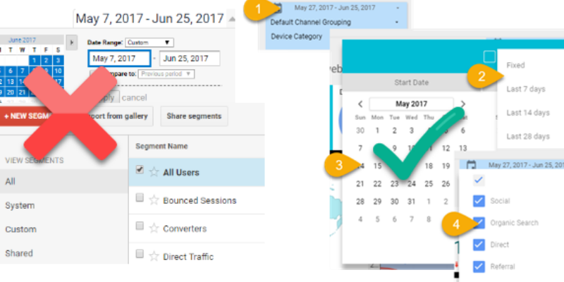
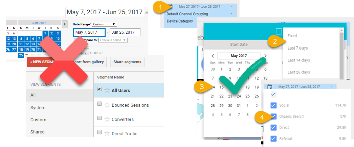
Easy Date Ranges and Filters:
1) Easy to use Filters to view impact of data, channel, and device (mobile, tablet, desktop) used
2) Easily select from pre-filled options, or custom data ranges (automatically displays previous range)
3) or custom data ranges (automatically displays previous range)
4) We have also included filters for channel and device used (not shown)
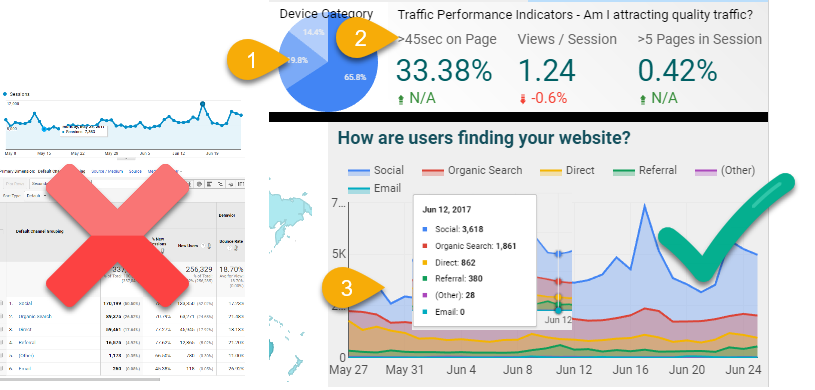
Understandable and Actionable Reports
1) Quickly see what devices users are using
2) Reporting Labels pose answers to questions, not hard to decipher math codes
3) Visual reporting not only looks better but allows you to quickly see the trends in where your visitors are coming from
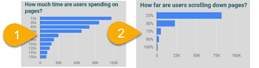
Actionable Metrics
Go away with “Vanity Metrics” and start measuring true page engagement today. See the Events and Goals setup through the MashMetrics Google Analytics Solution in living color!
There is a reason why there are a plethora of dashboard solutions around today. (Tableau, Qlik, Klipfolio, DOMO, grow,) the list goes on and on). They work. A good visualization sums up the same important data you will find in the raw reports, but translates it so the entire business can use the data to drive their business. While our lives may be too busy to drill into the plethora of reports available within the Google Marketing Platform, we hope our dashboards allow you to quickly see the important performance indicators to grow traffic, increase newsletter sign-ups, determine engaging content from blah…and more.
See how MashMetrics can turn your data into dollars: Dashboard Examples
What functionality do you put in your dashboards to make them more accessible? Please leave a comment here and follow us on Linkedin and Twitter!
3 Comments. Leave new
[…] are advanced MashMetrics templates that we’re happy to share – talk to us. We also create custom dashboards for you. In an example of a dashboard that we created for a client, the requirement was to look at […]
[…] your data sexy and attractive with Google Data Studio and MashMetrics Engagement and Awareness Dashboards. Tired of looking at confusing numbers, see your data visualized and compared within your own […]
well written article